Proposing a Data Science Solution to a Real-Life Problem
One of the reasons Data Scientist is coined the “Sexiest Job of the 21st century” is because it can effectively use collected data to create transformative products and services that could be the most viable and effective way of solving extreme challenges for businesses/organizations.
In weeks 5 and 6 at Metis Bootcamp, we dived into the “business” side of data science — how to identify, design, and scope data science projects. And what would be the best way to practice these concepts? You got it — Projects!
For the business project, we have to deliver a well-scoped project proposal and preliminary analysis (exploratory data analysis) to our target organization (“client”) to try to get our foot in the door by using Excel/Google Sheets and Tableau.
Yep! You saw it right… Excel/Google sheet!
But wait. We just did an EDA project and a regression project with Python on Jupyter Notebooks… Why are we going back to Excel?
After some storytime from the instructors, I could begin to fathom the reason behind learning one of the oldest analysis tools. It is a good platform for data scientists and the business domain to build bridges without having to explain the intricacy of our work. It can also be a useful tool for us to understand some domain knowledge with easy input from the domain experts. After two weeks of playing with Excel, I would start to believe that — “Excel is a powerful tool for data science.”
Back to the project…
“Starting is the hardest part.”
This is definitely true for starting a data science project. Finding the topic we’re interested in or the problem we want to solve is one thing. But finding the datasets (or website to do data scraping) is the other challenging part.
If you’re also having trouble finding datasets or ideas for projects, here are some resources I found pretty helpful:
- UCI Machine Learning Repository
- Kaggle
- Awesome public datasets
- Major US city open data — NYC Open data, Philly Open data, San Francisco Open data, etc.
- US Government’s open data
- FiveThirtyEight
- Data Is Plural
- Towards Data Science articles (more sources, inspirations)
This is by far not an exhaustive list, but it’s a good place to get you started!
Disclaimer: I am new to machine learning and also to blogging. So, if there are any mistakes, please do let me know. All feedback appreciated.
Business Project: Ratatouille Radar

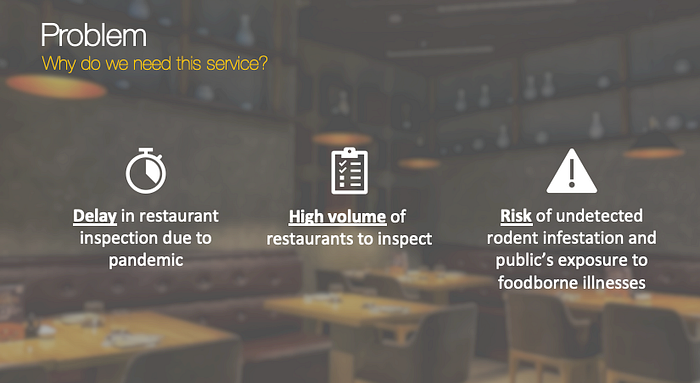
Last year, when the pandemic hits, restaurants were shut down in March and so did the inspections. Restaurants were reopened with outdoor dining in June 2020. But it wasn’t until October when restaurant inspection resumed. NYC encountered another problem in March of this year — a surge of rodent sightings in the city as COVID restrictions are lifted. The main challenge for NYC Health now is the delay in restaurant inspection, and a high volume of restaurants to inspect. There is also an increased risk of undetected rodent infection and the public’s exposure to foodborne illnesses that the rodents might be carrying.
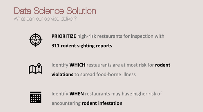
For this project proposal, my target audience is NYC Health Department. I see the opportunity to help NYC Heath restaurant inspectors efficiently identify restaurant health code violations by using a data science solution — Using 311 call data of rodent sighting reports to prioritize high-risk restaurants for inspection, identify which restaurants are at most risk for rodent infestation and when restaurants may have a higher risk of encountering rodent infestation.
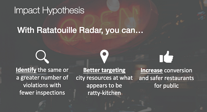
The impact hypothesis is that using the prediction model, NYC Health restaurant inspectors can identify the same or a greater number of violations with fewer inspections by better targeting city resources at what appears to be ratty-kitchen, so they may be able to increase conversions and safer restaurants by educating the restaurants that are in a high-risk zone for rodent infestation.
Data
The datasets used in this project include the NYC Restaurant Inspection Results, NYC 311 Calls, and NYC Restaurants from NYC open data. Those data set were too large to read in Excel directly. So I created a SQL database to store the dataset and used sqlalchemy to access the data in Python. Then, I took a subset of relevant data with pandas and store it as csv file to access in Excel.
Subset of data:
- NYC 311 call — Rodent Sighting reports in Commercial buildings
- NYC Restaurant Inspection with Rodent violation in 2019
Risk and Assumptions:
- Most rodent sightings are reported through 311 calls
- Most of the restaurants are in commercial buildings
- Most violations were caught in the year without pause in inspection
Tools
- SQLite for creating database
- sqlalchemy for accessing SQL database in Python
- Numpy and Pandas for data manipulation
- Excel for Exploratory Data Analysis
- Excel and Tableau for plotting data visualization and interactive dashboard
- Folium for Spatial visualization with time series
Preliminary Analysis
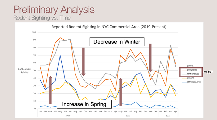
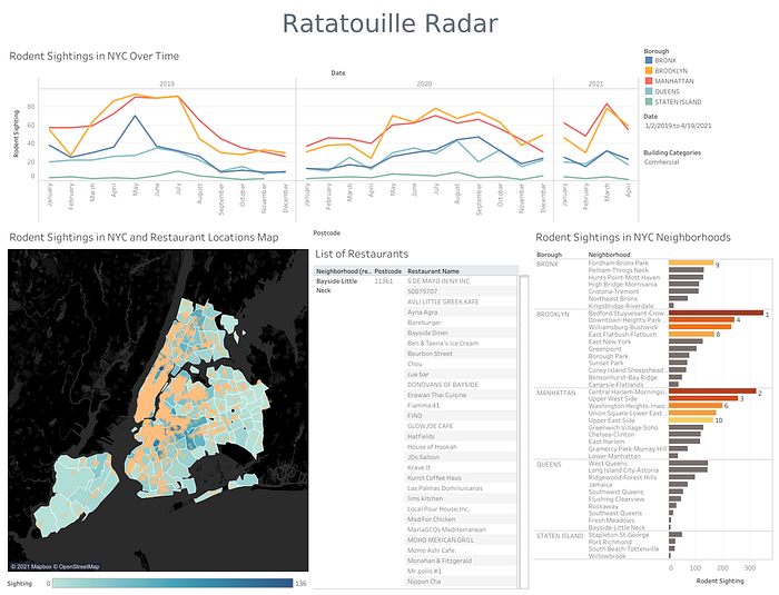
In the time-series graph of rodent sightings, there is a trend that shows an increase of sighting around spring and a decrease near winter. Comparing the sightings across NYC boroughs, the pattern shows that Brooklyn has the greatest number of rodent sightings in NYC.
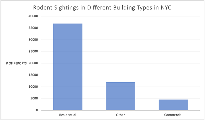
Further investigating on sightings in different types of building, it shows the residential buildings have the most sightings. Since most of the restaurants in NYC are in commercial buildings, I took the subset of commercial areas and compare the sightings across boroughs.
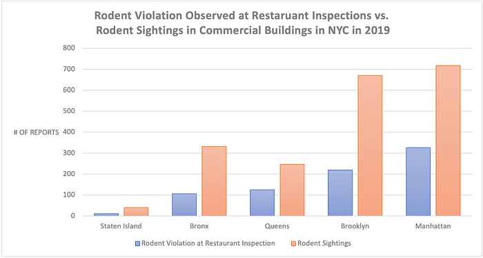
A paired barplot shows that Manhattan has the greatest number of rodent sightings in NYC commercial areas, which correlates with the pattern of the past rodent violation observed at restaurant inspection. There are more residential buildings in Brooklyn than in Manhattan, which is why Brooklyn exhibits the highest sightings in the overall comparison.
Analysis Takeaways + Interactive Dashboard
The main takeaways from the projects:
- 311 rodent sighting calls shows a similar pattern as rodent violation seen during restaurant inspection in 2019
- In NYC commercial buildings, Manhattan and Brooklyn have higher rodent sightings
- The trend shows the number of sightings increases in spring and decreases in winter.
The interactive Tableau dashboard can be used as a prototype of this project to identify the restaurants in high-risk areas for rodent violations based on sighting patterns.
Future Potential
Going forward, I believe this project can be developed into a predictive model that ranks the NYC restaurants by the likelihood of having rodent violations with time series and identifies dirty-kitchen hotspots with yelp reviews.
Takeaways
Always keep an open mind! And don’t underestimate what a tool can do. There is always more learning to do and more advancement we can make, even from one of the oldest analysis tools. Also, Tableau is fun! I love the visual and creativity you can unleash with it.
All in all, I still enjoy this module, seeing data science from a different perspective. I hope this project and some insights in this article are interesting for you. Thanks for reading :)
You can find my project details on my Github repo.